How to Make a PPC Graph on Google Sheets: A Step-by-Step Guide for Marketers
Tracking and analyzing Pay-Per-Click (PPC) data is crucial if you want to improve your ad campaigns and get the most out of your budget. One of the easiest and most effective ways to do that is by using Google Sheets to create clear, actionable PPC graphs.
Whether you’re a small business owner, freelancer, or marketing manager, this guide will walk you through how to create a PPC performance graph in Google Sheets—even if you’re not great with spreadsheets.
Why You Need a PPC Graph
A PPC graph visually shows how your ads are performing over time. Instead of just looking at raw numbers, you can easily see trends, compare metrics, and make smarter decisions. Some of the key metrics you can track include:
- Clicks
- Impressions
- Click-Through Rate (CTR)
- Cost Per Click (CPC)
- Conversions
- Cost Per Acquisition (CPA)
- Return on Ad Spend (ROAS)
When visualized properly, this data can help you:
- Spot which ads are working (and which aren’t)
- Find patterns in high or low performance days
- Adjust your bids, budget, and targeting more effectively
What You Need Before You Start
Before jumping into Google Sheets, make sure you have:
- Exported your PPC data from platforms like Google Ads, Facebook Ads, or LinkedIn Ads
- Key metrics like Clicks, Impressions, Conversions, and Costs
- A Google Account to use Google Sheets (free to use)
Step-by-Step: How to Create a PPC Graph in Google Sheets
Let’s go through the steps using a simple example.
Step 1: Collect and Organize Your Data
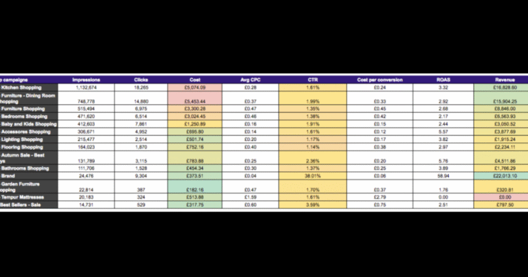
Paste or import your PPC data into a new Google Sheet. Here’s an example format:
| Date | Clicks | Impressions | CTR (%) | Conversions | Cost ($) | CPC ($) | ROAS |
| May 1 | 120 | 5,000 | 2.4 | 10 | 100 | 0.83 | 2.5 |
| May 2 | 150 | 6,000 | 2.5 | 12 | 125 | 0.83 | 2.8 |
| May 3 | 90 | 4,500 | 2.0 | 8 | 90 | 1.00 | 2.2 |
Make sure:
- Dates are in the first column.
- Each metric has its own column.
- Avoid blank rows or merged cells.
Step 2: Select Your Data
Click and drag to select the data you want to include in your graph. For example, if you want to compare Clicks and Conversions over time, highlight the Date, Clicks, and Conversions columns.
Step 3: Insert a Chart
- Click Insert > Chart
- Google Sheets will suggest a chart automatically. If not, go to the right panel (Chart Editor).
- Under Chart Type, select:
- Line Chart for trends over time
- Column Chart to compare daily metrics
- Combo Chart if you’re comparing two different types of metrics (like Clicks and Cost)
Step 4: Customize Your Chart
Use the Customize tab in the Chart Editor to:
- Add chart and axis titles (e.g., “PPC Performance – May 2025”)
- Change colors to match your brand (e.g., use orange #f37931 if you follow the SEO & Mores theme)
- Adjust the legend and labels for better readability
You can also enable:
- Data labels: show actual values on the chart
- Gridlines: to make it easier to compare numbers
Step 5: Analyze Your Graph
Now that your chart is ready, take some time to study it. Ask yourself:
- Are there days where clicks spiked or dropped?
- Do conversions increase as cost goes up?
- Which days performed best in terms of ROAS?
This analysis helps you identify what’s working and what to adjust in your campaigns.
Types of PPC Graphs You Can Make
You can create different types of graphs depending on what you want to analyze:
| Graph Type | Best For |
| Line Graph | Showing trends (e.g., clicks over time) |
| Column Chart | Comparing metrics per day |
| Combo Chart | Comparing 2+ metrics (e.g., clicks vs. conversions) |
| Pie Chart | Budget allocation across campaigns |
| Scatter Plot | ROI vs. cost analysis |
Advanced Tips
- Use conditional formatting in your table to highlight spikes or drops.
- Create separate sheets for each platform (Google Ads, Meta Ads, etc.).
- Use built-in filters and data validation to create interactive dashboards.
- Schedule weekly exports from ad platforms and paste into your sheet for live tracking.
Final Thoughts: Make Smarter PPC Decisions with Visual Data
Using Google Sheets to build a PPC graph is simple, cost-free, and powerful. You don’t need a complicated tool or expensive dashboard to start analyzing your campaigns.
By visualizing your data:
- You make smarter decisions
- You reduce wasted ad spend
- You improve campaign performance over time
This kind of clarity is exactly what helps businesses grow — and also what Google AdSense loves to see on your site: useful, original, high-quality content.
Need help setting up your PPC report sheet or template? Let us know at SEO And Mores, and we’d be happy to help